

MeasureIT – Issue 7.07 – Does the Knee in a Queuing Curve Exist or is it just a Myth?
June 26, 2023
Ensuring performance: How major retailers leverage user traffic to validate code changes
July 21, 2023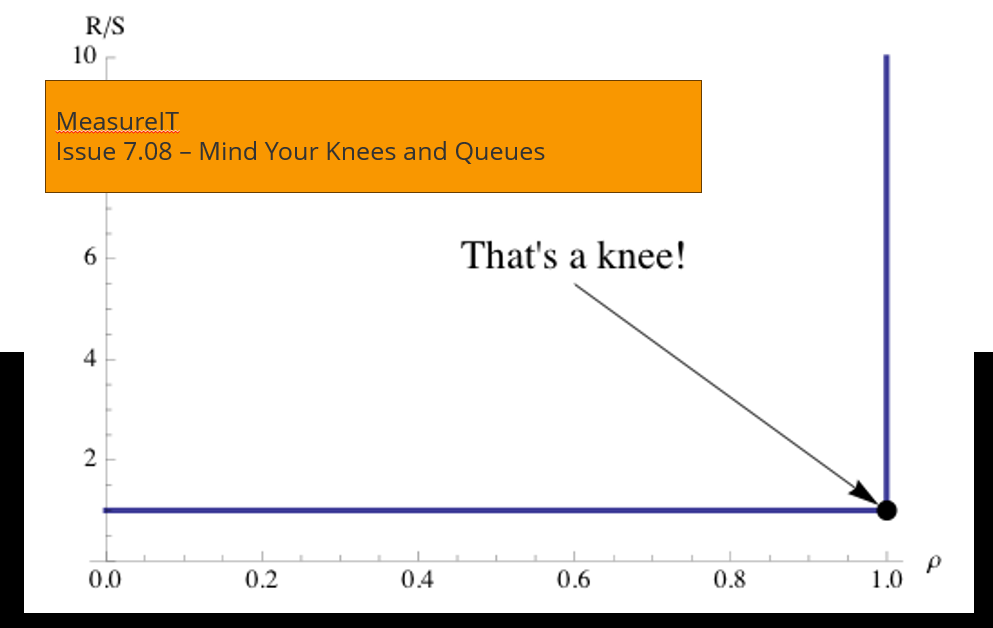
Responding to Hyperbole with Hyperbole
Original Publish Date: August, 2009
Author: Neil J. Gunther
Abstract
How do you determine where the response-time “knee” occurs? Calculating where the response time suddenly begins to climb dramatically is considered by many to be an important determinant for such things as load testing, scalability analysis, and setting application service targets. This question arose in last month’s MeasureIT. I examine it here in a rigorous but unconventional way. Example PDQ programs are included in an Appendix.
1 Motivation
In last month’s issue of MeasureIT, Michael Ley wrote an article entitled: Does the Knee in a Queuing Curve Exist or is it just a Myth?
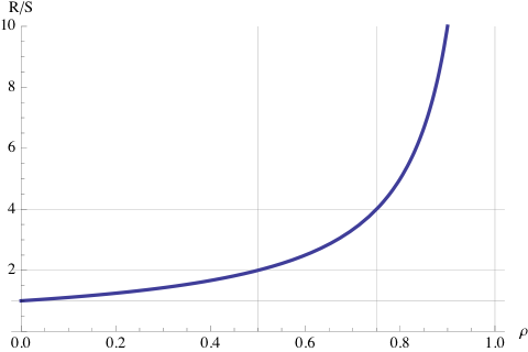
Figure 1: Classic response time profile for a single-server queue.
Referring to the general shape of the response time curve in Figure 1, he asked:
“Exactly what is the knee in the queuing curve? How would you define it and how would you calculate it?”
Apparently, he asked this question of a lot of people, including various performance experts and elicited a plethora of inconsistent responses. From all that he concluded:
“… that the `knee in the curve’ is a myth and one which, as the Mythbusters say, `is busted’.”
Since he didn’t ask me, I thought I would take a shot at addressing his question here. I believe I’m in a good position to do this because I have already considered a similar question that was raised by a student in one of my Guerrilla performance classes. I’ll come back to that variant of the question in Section 4. Although I didn’t consider it worth publishing formally, I did blog about it on March 8, 2008. This is a significant elaboration of that blog post.
1.1 My Response
I don’t know Michael Ley, but if I had been asked the same question, my unequivocal answer would have been:
-
- There most certainly is a well-defined knee.
-
- There is no there, there.
and the immediate corollary is:
-
- There is another there there, but it’s elsewhere.
To fully appreciate the indisputable consistency of my answer, I need to present a little more detail.
We have all seen plots like Figure 1 many times in the course of doing performance analysis. Because of this familiarity, we sometimes get sloppy about the way we refer to these curves. We forget about of the hidden assumptions, not to mention being blind to the rather deep math sitting behind these curves. Ley’s question presents an opportunity to bring some of those hidden details to the surface in a way that is not found in the usual performance analysis or queueing theory literature. I will endeavor to bring in only that mathematics which is necessary to clarify particular points in my discussion
1.2 The Point About Knees
Let’s start by clarifying some of the terminology that I will use in the subsequent sections.
Definition 1 [Function] A function is a mapping between points on the x-axis (domain) and points on the y-axis (range). The curve in Figure 1 is a continuous function that maps the load or utilization value (ρ) to a response time value (R/S).
Definition 2 [Extremum] The value of a function where its first derivative (slope) is zero. Since this can be either a maximum or minimum in the curve, it is also known as a turning point because the slope ceases to either increase or decrease. In the popular press, a maximum has become known as the “tipping point.”
Definition 3 [Point of Inflection] A point on the curve or continuous function where the second derivative (change in the slope) switches sign. A point of inflection must exist between any successive maximum or minimum.
Ley was apparently prompted (or provoked) to inquire further about the definition of a “knee” because certain instructors attempted to single out a unique point on the M/M/1 function:
“… the traditional 70% utilisation level on the curve…”
and things went downhill from there.
Definition 4 [Optimum] Here, I shall mean a unique point on the response time function which corresponds to the load of greatest advantage or least cost. In certain cases, the optimum is an extremum (see Definition 2).
Definition 5 [Knee] Although we see this word all the time in performance analysis, the term “knee’ is not a well-defined term in mathematics. It’s performance analysis idiom. Its closest mathematical couterpart is a continuous function (Definition 1) that exhibits a discontinuity [1] in its first derivative or slope. In the continuum of points belonging to the function, there can be one or more points where the slope changes abruptly, and the second derivative (change in the slope) becomes infinite.
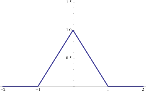
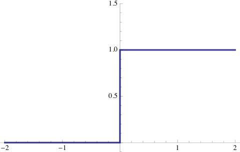
Figure 2: Triangle function (a) and Heaviside function (b).
Figure 2 shows two functions that have knee-like discontinuities: the triangle function: Λ (x) = 1− |x |, and Heaviside step-function: θ(x) = ∫x−∞ δ(s) ds, where δ(s) is the Dirac delta function2.
Example 1 If we think about the distance covered by an automobile as a function of time, then the first derivative is called the velocity and the second derivative is the acceleration. A common informal rating for an automobile is the finite amount of time it takes to accelerate from from 0 mph to 60 mph. A “knee” in the velocity function would correspond to going from 0 to 60 mph in zero seconds and would look like Figure 2(b). To accomplish this feat would require infinite acceleration.
Personally, I never use the word “knee” when referring to Figure 1 because I prefer to characterize it with several rules-of-thumb.
Example 2 In my classes I like to point out that ρ ≅ 0.0, ρ = 0.50 and ρ = 0.75 are more useful rules-of-thumb or ROTs. In the neighborhood of zero utilization (very light load), the response time (R) is expected to be close to a single service period (S), irrespective of whether that service period is measured in seconds, weeks or any other time base. At 50% load (center vertical line in Figure 1), the expected response time is two service periods (R=2S). At 75% load (vertical line right of center), the expected response time will be four service periods (R=4S).
It’s just as well to keep the acronym, ROT, in mind and not take such things too literally. Now, you can see why ρ = 0.70 is just another particular ROT. Contrary to what some people may tell you, there’s nothing sacred about 70% utilization. I’ll come back to ROTs in Section 4 and demonstrate how aiming for ρ = 0.70 utilization can actually lead to nonsense capacity estimates.
Definition 6 [Hyperbola] One of the family of conic section curves. A canonical hyperbola corresponds to slicing the cone at an angle. The applicability of the canonical hyperbola to response time curves is discussed in Section 5. A rectangular hyperbola corresponds to the special case of slicing the cone vertically. The applicability of the rectangular hyperbola to response time curves will be discussed shortly in Section 3. Appendix A contains more information about the properties of hyperbolæ.
Example 3 Cooling towers for a nuclear power plant have a hyperbolic cross-section, because they offer greater surface area than a cylinder of the same height.
Definition 7 [Asymptote] An asymptote is a line (or curve) that provides a characterization of a function of interest, as we move away from the origin. It is expressed in terms of how the function approaches the asymptote line. All the asymptotes we shall consider are straight lines or linear asymptotes. The curve of interest will be the response time function.
Example 4 A familiar example of a linear asymptote is the x-axis with respect to a negative exponential function: exp(−κx); usually associated with inter-arrival periods in queueing theory. The exponential function decays towards the x-axis, but only reaches it at infinity, and never goes below it.
2 D/D/1 Queue
Ley’s original question about knees was in reference to M/M/1 response times, like Figure 1. Let’s step back from the M/M/1 queue to a simpler case, viz., the single-server deterministic queue; D/D/1 in Kendall notation [3]. The response time profile is shown in Figure 3.
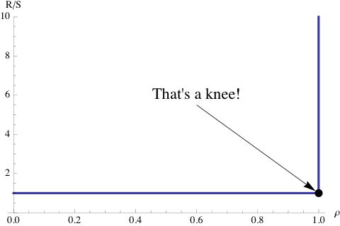
Figure 3: Response time profile for a single-server deterministic queue.
Here, D refers to both inter-arrival periods and service periods that are deterministic. Since the period between arrivals (the first D) is the same for all requests,we can think of objects equally spaced on a conveyor belt in a manufacturing assembly line. Consider a shrink-wrap machine putting plastic on boxes of software. The time to apply the shrink-wrap plastic is exactly the same for each box (the second D). Moreover, since the spacing between unwrapped boxes approaching the shrink-wrapper is the same distance, there is no possibility of boxes piliing up and creating a queue. Since no time is spent queueing, the response time profile looks like Figure 3.
It tells us that the response time remains completely “flat,” at R=S, unless the utilization of the shrink-wrap becomes 100% busy, in which case boxes suddenly begin to pile up on the conveyor belt. This could happen if, for example, the spacing between the boxes was shorter than the time it took to apply the shrink-wrap plastic. Then, the approaching boxes would start to collide with the shrink-wrapper.
Remark 1 The important point for our discussion is that the response time curve for D/D/1 possesses a knee at the x-axis location ρ = 1 (where server saturation occurs), consistent with Definition 5. In fact, it’s akin to the discontinuity in Figure 2(b), approached from the left side. To paraphrase Crocodile Dundee: That’s a knee!
Another way that a queue can arise is, if the boxes of software were thrown onto the conveyor belt at random times (a Poisson process). That would correspond to an M/D/1 queue (Figure 4) with a non-zero waiting time contribution to the response time in the range 0 < ρ < 1.
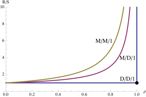
Figure 4: Response time profiles for three single-server queues.
If the service periods also became randomized, then the waiting time contribution would be even greater than that for M/D/1 (see Figure 4). Random service periods could occur if, in addition to the fixed time for applying the plastic wrap, it also included the variable time to fill the boxes with a CD, user manual, bubble wrap and so on, The conveyor belt would then behave like an M/M/1 queue.
Remark 2 [Load Testing] Incidentally, that’s why it’s important for load testing tools to facilitate exponential think times in client scripts. It forces significant queueing to occur, which may reveal buffer overflows and other performance limitations that would otherwise not be detected with constant or uniformly distributed think times between transactions. This point becomes even more relevant for Section 5.
Neither M/D/1 nor M/M/1 response time profiles possess a knee that is consistent with Definition 5. There is no there, there. However, one could literally ask: Is there a point on those curves that comes closest to the D/D/1 knee? If so, that could be useful for determining optimal loading of a computer system, in the sense of Definition 4.
3 M/M/1: Thinking Outside the Box
In this section, I am going to examine the M/M/1 queue in a rather unconventional way. From the standpoint of performance analysis, the utilization of a physical resource cannot exceed 100%. Similarly, in queueing theory, the server utilization is only defined for the range of values: 0 ≤ ρ < 1, because as ρ→ 1, the normalized response time:
|
|
(1) |
rapidly approaches infinity. The technical description is, it “blows up” at ρ = 1. As you can see in Figure 4, a similar constraint holds for both M/D/1 and D/D/1 response times.
3.1 Negative Utilization
In the foregoing, however, I only need to pay attention to the usual range restriction on ρ, if I’m interested in physically meaningful performance metrics (which I usually am). Otherwise, I can put on my mathematician’s hat and freely chose ρ outside its conventional range; even if it doesn’t make physical sense. For example, if I define x to be any value on the real number line: −∞ < x < ∞, then eqn. (1) becomes:
|
|
(2) |
I’ve also replaced R/S by y to allow for negative values there, should they arise. See Section 5.
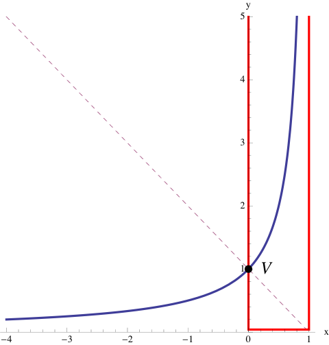
Figure 5: The response time function in Figure 1 with 1:1 aspect ratio and extended outside the region of physically meaningful performance metrics (red box) to reveal its hyperbolic character. The dashed line is an axis of symmetry known as the transverse axis. The point (V) where the transverse axis intersects the hyperbola is called the vertex.
Figure 5 shows what this unrestricted generalization of the response-time curve looks like, when we allow x to become negative. The red box represents the region to which we are usually confined when doing performance analysis. The blue curve belongs to a class of functions called a hyperbola in Definition 1. The hyperbola has two asymptotes. See Appendix A for more details.
The relative angle between the asymptotes can range between 0 and 180. That the asymptotes in Figure 5 are orthogonal, i.e., make an angle of 90, accounts for the use of the term rectangular to describe this particular hyperbola variant. See Definition 1 The negative x-axis acts as one asymptote, while the other is formed by the vertical line parallel to the y-axis at x=1. The diagonal dashed-line is an axis of symmetry called the transverse axis. The point V, where the hyperbola and the transverse axis intersect, is called the vertex.
3.2 Hyperbola Vertex as an Optimum
Here now, for the first time in this discussion, we can identify a unique point V on the curve which is a candidate for an optimum, consistent with Definition 4. If we rotated Figure 5 clockwise by -45 degrees so that it was oriented like Figure 13, V would correspond to a minimum. Presumably, this is one aspect that the performance experts were dithering over when trying to address Ley’s question. But it’s not a minimum in the orientation of Figure 5. The minimum of that curve lies out at x → −∞.
The vertex at (0,1) is indeed a single point on the hyperbola that can be uniquely defined in a mathematically rigorous way. It also sits at the right place to represent an optimum, viz., the minimal distance to the center at (1,0). But that’s only significant if you are just considering the hyperbola itself. Unfortunately, the vertex V is precisely the point of zero load (ρ = 0) at the edge of the red box in Figure 1 and thus, is quite useless for characterizing a response time optimum.
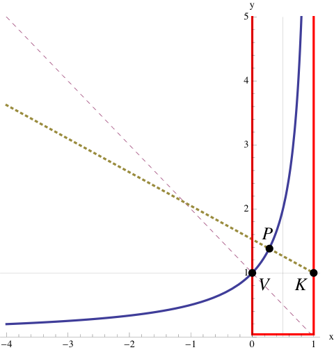
Figure 6: The optimum P defined by the intersection of the M/M/1 hyperbola with the normal (dotted line) which passes through the knee K. P is not a point of symmetry.
In Figure 3, the D/D/1 knee is located at (1,1), not (1,0) as in Figure 5. What happens if we try to correct for that difference in the M/M/1 curve? Figure 6 shows an alternative optimum, P, which is not a point of symmetry on the hyperbola. It is defined by the intersection of the M/M/1 curve with the normal line (orthogonal to the tangent line) that passes through (1,1). The length PK corresponds to the minimal distance, from the hyperbola to the D/D/1 knee.
Although P is a better candidate than V, for an optimum, it is still not very useful because it is located at a load point corresponding to ρ < 0.5 in Figure 1. Put differently, although P lies inside the red box, it is located in the light-load performance region, and that’s not what people have in mind when they are trying to define response time thresholds. Can we define an optimum for ρ > 0.5?
3.3 Latus Rectum as an Optimum
Consider Figure 7. The dashed line segment labeled LR, runs perpendicular to the transverse axis, and is known as the latus rectum (No, it’s Latin for “straight side.” See Appendix A). The latus rectum intersects one of the foci (F = aε) of the hyperbola and, more interestingly, it also intersects the hyperbola at the point L; above the point P in Figure 6. This is another point on the hyperbola that is geometrically well-defined, and more importantly, it’s inside our performance region of interest. Can we use it to define an alternative optimum?
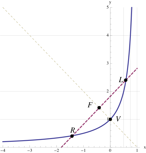
Figure 7: The dashed line segment (LR), perpendicular to the transverse axis, is called the latus rectum. The latus rectum intersects one of the foci (F=aε) of the hyperbola. It also intersects the hyperbola inside the performance region of interest (red box in Figure 5) at the point L.
Well, we can, but it’s still not very satisfying because it corresponds to a load value of ρ = 0.58. As I already pointed out in Example 2, ρ = 0.5 corresponds to a stretch factor of 2 service periods so, why go to all the trouble of applying the latus rectum to define a load point that is only 50% bigger than that ROT?
What about choosing a line parallel to the latus rectum but sitting further out at 2, 3 or 4 multiples of the focal distance F? Indeed, such choices would certainly correspond to points further up the hyperbola and they would be inside the region of interest. But when you’ve finally settled on a multiple of 4, I’ll prefer a multiple of 5, and the next guy will want 6. There’s no end to this because such multiples have no rigorous definition in the context of the hyperbola. They are no longer unique. In other words, even after all this rigorous geometrical effort, we are no better off in terms of defining a true optimum.
3.4 Service Level Objectives
In the final analysis, this is why we have service levels, service targets and service level agreements. Figure 8 shows some examples of how such service goals can be related to the response time function. Bear in mind that the service targets shown here are based on average response times, whereas realistic service targets should be chosen on the basis of additional statistical information, such as percentiles and so on.
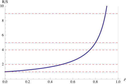
Figure 8: Example service level objectives shown as horizontal lines for M/M/1 response times.
From a mathematical standpoint, these values are completely arbitrary because there is no convenient way to specify them more rigorously as optima consistent with Definition 4. To avoid the appearance of whimsy, such targets are usually selected behind closed doors after some kind of concensus is reached amongst the interested parties or stakeholders. The question that service levels really tries to address is, what response time or stretch factor can you tolerate? Compared with the foregoing discussion about optima defined by the geometrical properties of hyperbolæ, the answer to that question can only be subjective, not mathematical.
At best, a service level corresponds to choosing a horizontal line in Figure 8. Once that choice has been made, the performance analyst can then determine what the corresponding load (ρ) ought to be. Even after this process has been exercised, the agreed upon service levels are only as good as the last consensus meeting. If better response times are observed when the application is being used, those will become the new service objectives in the next round of service level negotiations. This is why service levels are often more about politics than performance.
4 M/M/m Queue
In Section 3 the analysis focused on a single-server queue. What happens if we consider the more general case of a multi-server queue? This is the sort of simple queueing model that might apply when doing preliminary capacity planning or performance analysis for the new generation of multicore processors. Historically, it’s the queueing model Erlang originally developed to address capacity planning questions about the “Internet” of his day; the telephone system in 1917 [3].
Figure 9 shows some typical response time profiles for M/M/m with m=1,2,3,9,16, chosen arbitrarily. The PDQ code to produce it is provided in Appendix B listing B. As you might expect, the uppermost curve (m=1) corresponds to the response time profile in Figure 1. As we add more server capacity, we see that the response time remains close to a single service period, i.e., R/S = 1, at higher loads than is the case for M/M/1. Another way of saying the same thing is, that the response time curve for increasing m, appears to get sharper in the direction of the lower-right corner, which we know from Section 2 is the knee of the D/D/1 response time function.
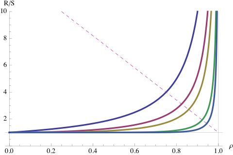
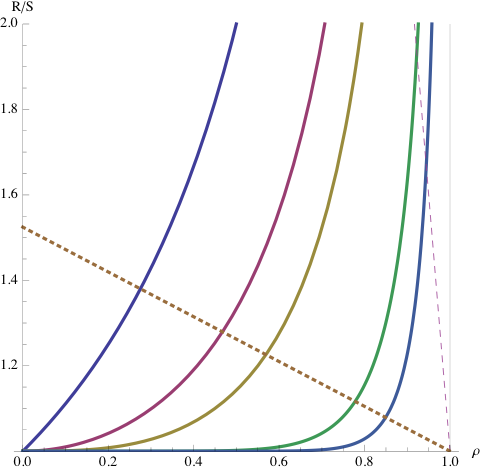
Figure 9: Response time standard curves (a) for m=1,2,3,9,16 and (b) with a 1:1 aspect ratio.
4.1 The Multicore Wall
The M/M/m queue can be used a simple model of multicore scalability, where the waiting line represents the scheduler’s run-queue. Referring to the 16-way response time function (lowest curve) in Figure 9 as the load is increased, R remains quite flat right up to about 90% core utilization. Only above ρ = 0.90 does the response time increase, but it increases very suddenly! And that’s the rub. Recalling the ρ ≤ 0.70 ROT of Section 1.2, it is clear that R = S, well above that “traditional” load point. In fact, the utilization needs to be much higher. If you’ve paid for a high-end 16-way multicore machine, you had better be making use of all those cores as often as possible in order to justify the expense of the hardware or software development or both. Its a bit like buying a Ferrari. You need to drive it at top speed (otherwise, what’s the point?), but if you redline it for too long, the engine might blow up. The redline represents a wall; the multicore wall. Applying the tradition 70% ROT would lead to a serious waste of capital investment dollars.
Remark 3 As m → ∞, the M/M/m response time profile approaches that of D/D/1. This is a consequence of the increasing capacity from m servers eliminating the likelihood that a waiting line will form.
As I alluded to in Section 1, an astute Guerrilla alumnus asked me if those sharpening curves fell on a line (the dashed line in Figure 9a) in such a way that the line could be used to better characterize response time performance. At the time, I wasn’t sure myself. When I finally did look into it, I discovered something even more complex than I have presented so far.
4.2 Rational Spaghetti
Figure 9(b) is Figure 9(a) re-plotted with a 1:1 aspect ratio. We see immediately that the curves take on a totally different appearance. It’s also clear that the dashed line is a kind of optical illusion. The reason this is just an illusion, is similar to the explanation given in Section 3. When you look outside the performance box, the curves take on a totally different character.
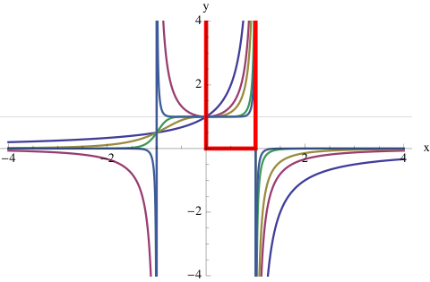
Figure 10: The M/M/m counterpart of Figure 5. The main difference is that y-values can also be negative. The red box indicates the region of physically meaningful performance metrics.
Relaxing the range restriction on ρ in the same way we did before, i.e., ρ→ x, produces the amazing curves shown in Figure 10. They resemble colored spaghetti and are obviously more complex than anything we considered for M/M/1. They fall into two major categories:
-
- Functions with even-valued m exist only in the upper half-plane.
-
- Functions with odd-valued m can exist in both the upper and lower half-planes.
The denominator of these response time functions is a polynomial of the form 1−xm, and therefore it has singularities (infinities) whenever xm=1. Like eqn. (1) these functions also blow up at the singularities, but now the infinities can go in either the positive or negative y-direction. These response time functions are known as rational functions, and the functions with m > 1 are not hyperbolæ.
Regrettably, just like M/M/1, it it not possible to define a unique line of knees for M/M/m, despite initial appearances in Figure 9a).
5 M/M/1//N Queue
All the queueing systems that I’ve discussed so far can contain an arbitrary number of requests. Although Ley doesn’t define it, that’s the meaning of the Kendall notation: M/M/1/∞ in his article. It’s accepted convention to drop the ∞ part, but it denotes an infinite source of requests, like the Internet. And just like the Internet, a server could potentially get flooded by a Denial-of-Service (DoS) attack, for example, and the web site could blow up (Figure 11).
Figure 11: What a DoS “blow up” looks like.
The same thing can happen in response time equations, like eqn. (1). If too many requests are allowed, the waiting line will grow unbounded, but instead of getting an HTTP 503 or a failure notice like Figure 11, it will give spurious numbers. To avoid this problem, the constraint ρ < 1 is imposed on the per-server utilization.
5.1 Load Test Systems
There is another type of queueing system, where the number of requests allowed is a fixed and finite number, N. You can almost guess that the Kendall notation is M/M/1//N; the double slash just means both the total number and the queue size can never be bigger than N.This queue is mentioned obliquely in Definition 7 of Ley’s article. Its characteristics will also be very familiar to anyone involved with load-testing, application stress-testing or benchmarking [4]. By their very nature, these systems involve a finite number of requests generated by the load-test clients, often with some think delay in between. This changes everything!
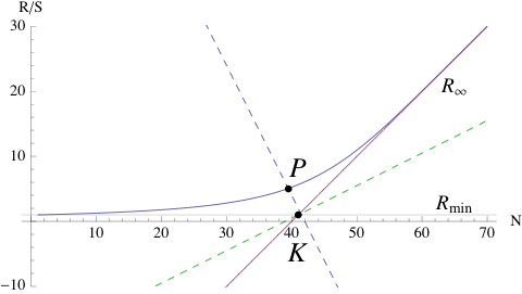
Figure 12: Response time “hockey stick” profile for a single-server queueing system containing N requests. The asymptotes intersect at the point K, which is the logical counterpart of the knee in Figures 3 and 6. The dashed line are the transverse and conjugate axes.
Primarily, the response time formula is completely different from eqn. (1). For a single-server queue with a service time S and think delay Z, the normalized response time is given by [3]:
|
|
(3) |
where it should be noted that the utilization (and therefore the corresponding response time) depends nonlinearly on the particular value of N. This important difference is denoted ρ(N) and R(N), respectively. The parameters, S and Z, are constants and independent of N.
The corresponding profile is shown in Figure 12 and the PDQ code to produce it is provided in Appendix B listing B. The phrase “hockey stick” is often used to describe this type of response time curve. It also looks remarkably like Figure 13 rotated counterclockwise, so that one of the asymptotes becomes aligned with the x-axis.
Remark 4 A serious point of confusion is introduced in Ley’s Definition 7. An attempt is made to demonstrate that there is no knee in the M/M/1//N curve by plotting the response time R against ρ in a manner similar to Figure 1. This serves no good purpose. For M/M/m, utilization is the independent variable, and a linear function of request rate λ, due to Little’s law ρ = λS. Therefore, equal increments in λ (request rate) correspond to equal increments in ρ. The increments on the x-axis scale remain equal. M/M/1//N, on the other hand, is a self-regulating system due to the constraint of finite requests, and the utilization becomes a nonlinear function of the N requesters; denoted by ρ(N) in eqn. (3). Therefore, equal increments in N do not produce equal increments in ρ(N) on the x-axis scale. N is the independent and linear variable. That’s why we plot R against N, and not ρ.
5.2 Asymptotes and Optima
From Definition 7, the performance bounds [3] are given by the asymptotes:
|
|
(4) |
They intersect at the point K, which is the logical equivalent of the knee in Figure 3. The position of K on the N-axis is given by [3]:
|
|
(5) |
which is a first-order indicator of the optimal load point for N requests in the queueing system [3]. To the left of Nopt, resources are generally being underutilized. To the right of Nopt, the system tends to be driven in saturation, the waiting line grows and response climbs along the R∞ asymptote.
Remark 5 A plausibly more accurate optimum is given by the point P in Figure 12. It’s value on the N-axis, NP is always less optimistic than Nopt.
Notice that, unlike M/M/m, these asymptotes are not orthogonal and the R∞ asymptote can be extended to any desired length. This accounts for the “hockey stick” appellation often given to the M/M/1//N response time profile.
So, there is a knee there, at the intersection of the asymptotes. It also corresponds to a point of server saturation, i.e. ρ(Nopt)=1, similar to the D/D/1 knee. Unlike D/D/1, however, we can drive the system beyond that point and approach infinity more gracefully as it climbs linearly along the hockey-stick handle. This follows from the self-regulating characteristic of M/M/1//N. Although Nopt is not a knee on the response time curve, like P, it dose offer a simple first-order guideline for optimizing response times.
6 Conclusion
Contrary to Ley’s conclusion, there really is no myth to bust. There does, however, seem to be plenty of bovine dust clouding the issue, due to incorrect and sloppy use of performance analysis concepts. A knee (consistent with Definition 5) does exist for both open queues, like M/M/1, and closed queues, like M/M/1//N. It lies at the intersection of the response time asymptotes.
In the case of M/M/1, there is no there, there. There is no “knee” that fulfills Definition 5 lying on the response time curve itself. The server saturation point (ρ = 1) cannot be reached without the system going unstable (infinite queueing). It was noted in Remark 3, that the saturation point can be approached more closely by an M/M/m queue as m → ∞. Nor, it turns out, are there any other convenient optima, consistent with (Definition 4). As Ley himself recognized, this essentially eliminates all 10 of his expert responses. Of course, that’s why we resort to rules-of-thumb or subjective service targets. No news there-or, it shouldn’t be news.
The situation is subtly different for M/M/1//N. There is a there there, but it’s elsewhere. The server saturation point, ρ(N)=1, can be reached and exceeded, with the system remaining stable. The location of the knee K in Figure 12 is determined by the input parameters: S, N, and Z, and its x-axis component is given by Nopt, which is an approximate optimum. A more accurate optimum is represented by the point P on the response time curve. Calculating its exact location is left as an exercise for the reader.
I suspect that a lot of the confusion surrounding the use of the word knee, has to do with people (even experts) cavalierly blurring the distinction between Figure 12, where there is a knee that can be referenced as a guiding optimum, and Figure 1, where the knee is a limiting case and not a useful optimum. That so many “performance experts” gave so many bizarre answers is alarming, but making us aware of those phantasms may have been the more important outcome of Ley’s questioning. Next time, you will know how to apply hyperbolæ to such hyperbole.
References
- [1]
- R. N. Bracewell, The Fourier Transform and Its Applications, McGraw-Hill, 1978
- [2]
- P. A. M. Dirac, The Principles of Quantum Mechanics, Oxford University Press, 4 edition 1982
- [3]
- N. J. Gunther, Analyzing Computer System Performance with Perl::PDQ, Springer-Verlag, 2005
- [4]
- N. J. Gunther, “Benchmarking Blunders and Things That Go Bump in the Night.” Part I and Part II. CMG MeasureIT, 2006
Appendices
A Hyperbolæ
This Appendix summarizes more than you ever wanted to know about hyperbolæ.
A.1 Canonical Hyperbola
A canonical north-south opening hyperbola is defined in Cartesian coordinates by:
|
|
(6) |
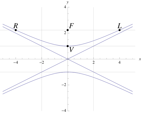
Figure 13: Equation (6) with a=1 and b=2 centered at h=0 and k=0.
Referring only to the upper curve, its properties are:
- Asymptote rectangle width:
- x = ±b ≡ ±2
- Asymptote rectangle height:
- y = ±a ≡ ±1
- Asymptotes:
- diagonals y = ±ax/b ≡ ±x/2
- Vertex:
- V is the point closest to the center (h,k) located at (h,a) ≡ (0,1)
- Transverse axis:
- same as y-axis
- Conjugate axis:
- same as x-axis
- Eccentricity:
- ε = √{a2 + b2}/a ≡ √5, where ε > 1 for hyperbola.
- Focus:
- distance from center (h,k) to each focus F is aε ≡ 2.236
- Latus rectum:
- intersects hyperbola at ±b2/a ≡ ±4 and also passes through F
A.2 Rectangular Hyperbola
A rectangular hyperbola is the same as a canonical hyperbola but with a=b, such that the enclosed rectangle becomes a square. Equation (6) reduces to:
|
|
(7) |
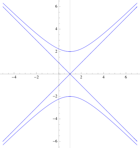
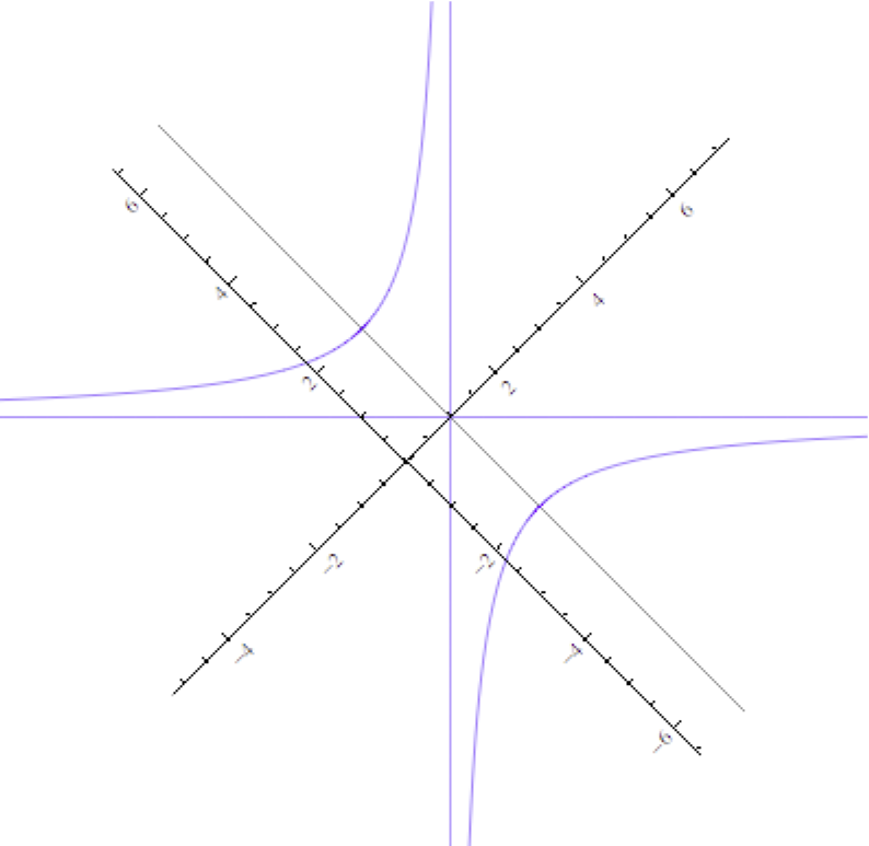 Figure 14: Rectangular NS hyperbola and same hyperbola rotated by +45 degrees.
If we rotate eqn. (7) counterclockwise by 45, the new coordinates are:
|
|
(8) |
Substituting into eqn. (7) yields:
|
|
(9) |
Setting a = √2 makes it equivalent to eqn. (2) in Section 3.1.
Remark 6 The relationship between X and R in Little’s law N = XR has the form of a rectilinear hyperbola. Little’s law is also the basis for eqn. (3).
B PDQ-R Models
The following PDQ models, written in the R language for statistical computing, can be used to generate some of the response time plots appearing the text.
# Plot M/M/m response time for CMG MeasureIT piece.
# Created by NJG on Thursday, July 23, 2009
library(pdq)
# PDQ globals
servers<-c(1,2,4,16,32,64)
stime<-0.499
node<-“qnode”
work<-“qwork”
for (m in servers) {
arrivrate<-0
xc<-0
yc<-0
for (i in 1:200) {
Init(“”)
arrivrate<-arrivrate + 0.01
aggArrivals<-m*arrivrate
CreateOpen(work, aggArrivals)
CreateMultiNode(m, node, CEN, FCFS)
SetDemand(node, work, stime)
Solve(CANON)
xc[i]<-as.double(aggArrivals*stime/m)
yc[i]<-GetResidenceTime(node,work,TRANS)/stime
}
if (m == 1) {
plot(xc, yc, type=”l”, ylim=c(0,10), lwd=2, xlab=expression(paste(“Server load “,(rho))),
ylab=”Stretch factor (R/S)”)
title(“M/M/m Response Time”)
text(0.1,6, paste(“m =”,paste(servers[1:length(servers)],collapse=’,’)), adj=c(0,0))
abline(h=1,col = “lightgray”)
abline(v=0.5,col = “lightgray”)
abline(h=2,col = “lightgray”)
abline(v=0.75,col = “lightgray”)
abline(h=4,col = “lightgray”)
} else {
lines(xc, yc, lwd=2)
}
}
# Plot M/M/1//N response time for CMG MeasureIT piece.
# Created by NJG on Wednesday, July 22, 2009
library(pdq)
# PDQ globals
Nload<-60
think<-80
stime<-2
node<-“qnode”
work<-“qwork”
# R plot vectors
xc<-0
yc<-0
for (n in 1:Nload) {
Init(“”)
CreateClosed(work, TERM, as.double(n), think)
CreateNode(node, CEN, FCFS)
SetDemand(node, work, stime)
Solve(EXACT)
xc[n]<-as.double(n)
yc[n]<-GetResponse(TERM, work)
}
nopt<-GetLoadOpt(TERM, work)
plot(xc, yc, type=”l”, ylim=c(0,50), lwd=2, xlab=”Number of requests (N)”, ylab=”Response time R(N)”)
title(“M/M/1//N Response Time”)
abline(a=-think, b=stime, lty=”dashed”, col=”red”) # Rinf
text(55, 25, expression(R[infinity]))
abline(a=-(nopt-4)/2, b=1/stime, lty=”dashed”, col=”blue”) # conj axis
text(55, 10, “Conjugate axis”)
abline(a=(think+4), b=-stime, lty=”dashed”, col=”blue”) #trans axis
text(20, 30, “Transversenaxis”)
abline(stime, 0, lty=”dashed”, col = “red”)
text(20, 0, expression(R[min])) # Rmin
text(nopt+6, 0, paste(“Nopt=”, as.numeric(nopt)))
Footnotes:
1Copyright © 2009 CMG, Inc., and Performance Dynamics Company.
2 Dirac extended the delta function concept in order to get a better mathematical handle on certain knee-like discontinuities that arose in the formulation of quantum mechanics [2].


