


Original Posting: July, 2009
Author: Michael Ley
Recently I attended a session at a conference entitled “An Introduction to Capacity Management“. Not that I needed it you understand, no perish the thought, but I was interested to see how a distinguished capacity-performance expert from a global consultancy would describe the discipline.
As a teaser, he put up the formula for the M/M/1 queuing curve and later explained that when running a system a site should aim to operate it around the “knee in the [queuing] curve“. Well, as he had been asking for questions, at this point I thought I would throw him a softball question.
Exactly what is the knee in the queuing curve? How would you define it and how would you calculate it?
Silence…followed by some vague discussion about the point on the curve where you would be waiting too long for service. When he started pointing away from the traditional 70% utilisation level on the curve, I pressed for a more exact answer. None was forthcoming. Finally, to move on, he referenced me to a later modelling session which would deal with it in more detail.
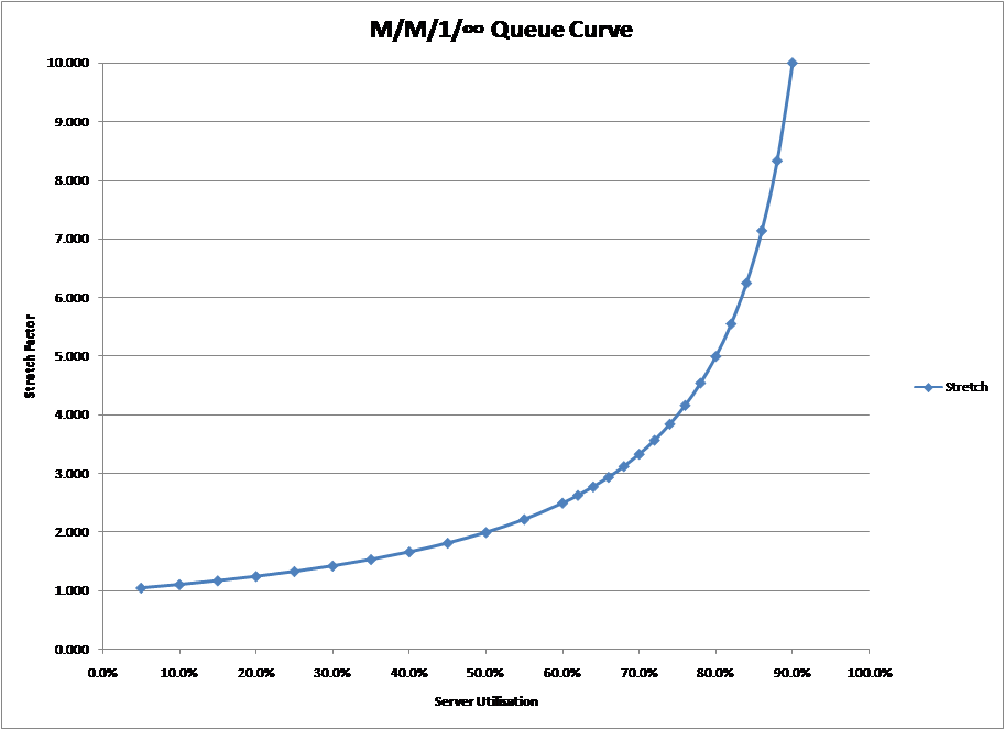
I went to that later modelling session, asked the same softball question, and still got no definitive answer. Yet everyone in capacity and performance work has heard of the” knee in the curve” and believes that it is the point beyond which response time decays dramatically. It seems so obvious, just look at the M/M/1 curve in the chart below on the left and you can see how the line just breaks away at around 70%.
 |
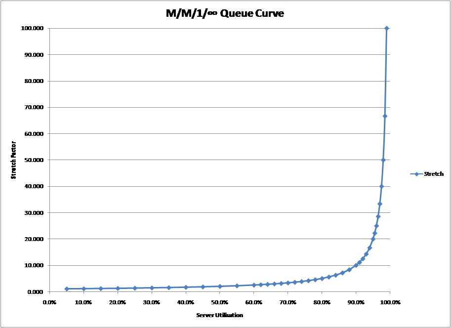 |
But going by sight alone can be deceptive and just saying something is there because you can “see it” may be misleading. Look at the graph on the right. It appears fairly obvious that in this case, the “knee in the curve” is over 90%. Yet look closely and you will see that they are the same curve, generated by exactly the same formula; the only thing that has changed between the two charts is the scale of the vertical (response time) axis.
Worried? Well I was, so I started asking colleagues for their definition of the “knee in the curve“, researching it on the internet and even posing it as a challenge to members of UKCMG (UK Computer Management Group).
As a result of this effort, I so far have collected 10 different versions of how the “knee in the curve” can be defined and calculated. They differ in whether they refer:
-
- To response time or wait time (note: response time = service time + wait time)
-
- To absolute change or % change
-
- To more esoteric formulae or definitions
But do any of them work in yielding the traditional answer of around 70%?
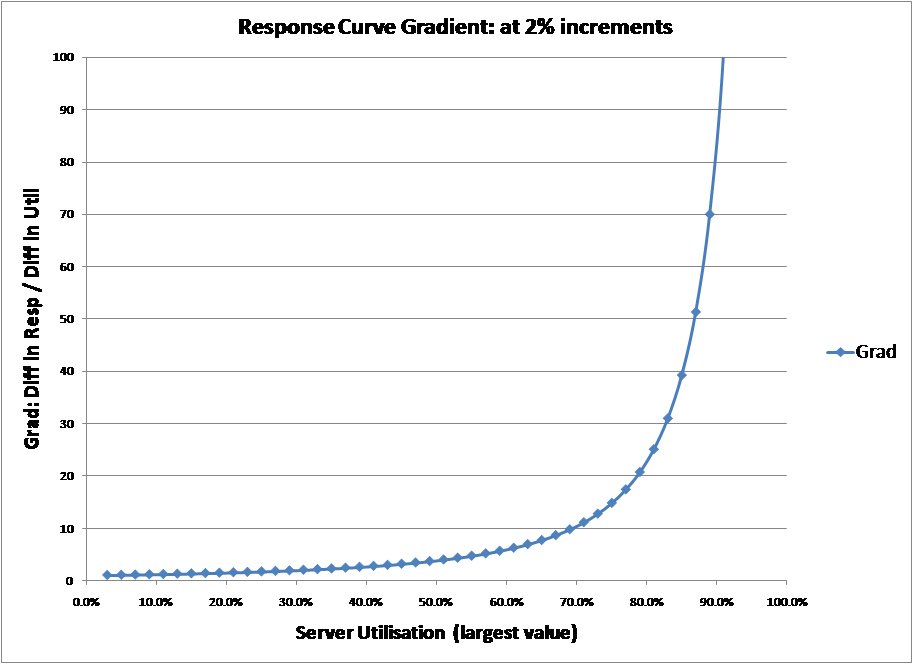
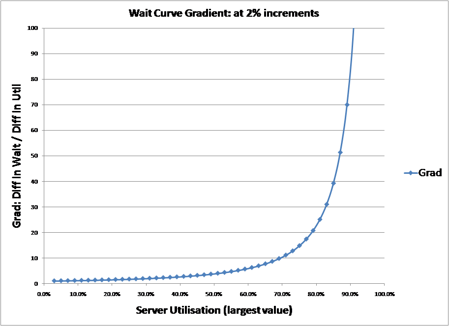
Definition 1: It’s the point on the response/wait time curve with the greatest gradient
The most straightforward of the definitions collected. By enumerating the M/M/1 curve and calculating gradient as the change in response time or wait time divided by the change in utilisation it is possible to show the gradient over a range of values. The charts below show the results for both the response time curve and wait time curve. Both are almost identical and, as can be seen, the greatest gradient of either curve is at 100% server utilisation.
 |
 |
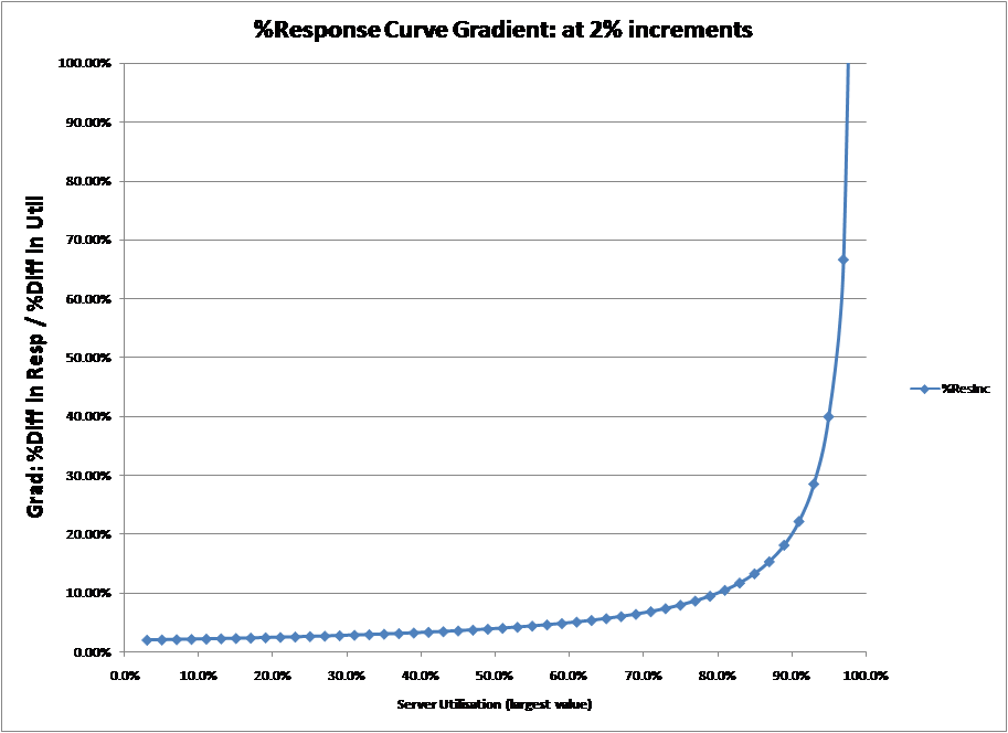
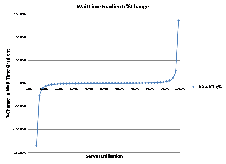
Definition 2: It’s the point on the response/wait time curve, in % terms, with the greatest gradient
Effectively a modification of definition 1 that can be validated by enumerating the M/M/1 curve and calculating gradient as the %change in response time or wait time divided by the %change in utilisation. The charts below show the results for both the response time curve and wait time curve. In this case, the gradient of the response time curve is at maximum at 100%, while the wait time curve has two maximums, at 0% and 100%.
 |
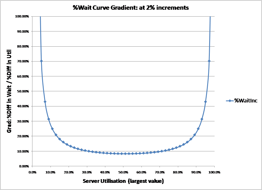 |
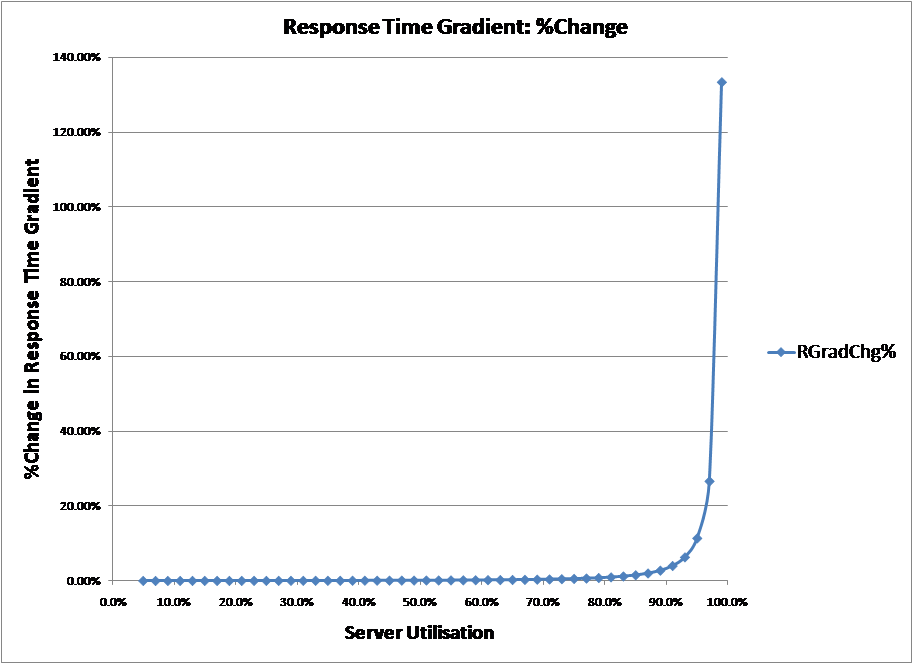
Definition 3: It’s the point on the curve where the response/wait gradient accelerates
Recently, one consultancy stated “modelling tools detect the point at which queuing accelerates – commonly known as the ‘knee in the curve’“. While not rigorous, this definition depends not on the gradient of the graph but the rate of change of the gradient, i.e. the acceleration of the curve rather than the speed of the curve.
Again this definition was validated by calculating gradient as the %change in response time or wait time divided by the %change in utilisation (as in definition 2) and then calculating the %change in that gradient over a range of values. The charts below show the results for both the response time curve and wait time curve.
 |
 |
From the charts, the original proposition can be easily dismissed as rate of change of the gradient, its acceleration is always positive. Sometimes the definition is re-phrased to “it is the maximum acceleration of the curve“. However, as can also be seen from the charts, % rate of increase of the gradient of the response time curve is at maximum at 100%, while the % rate of change of the wait time curve has two maximums, at 0% and 100%.
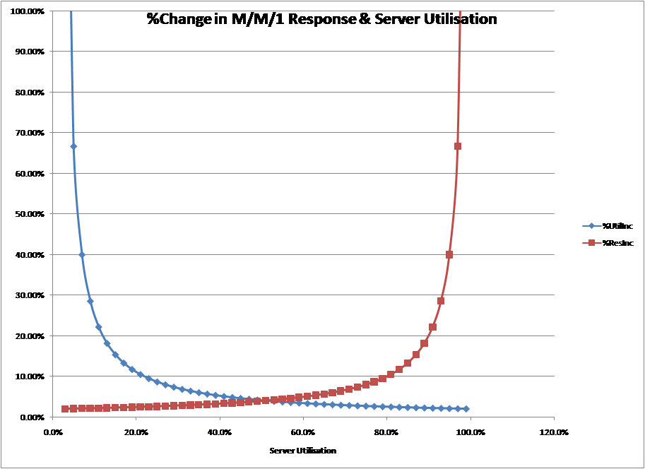
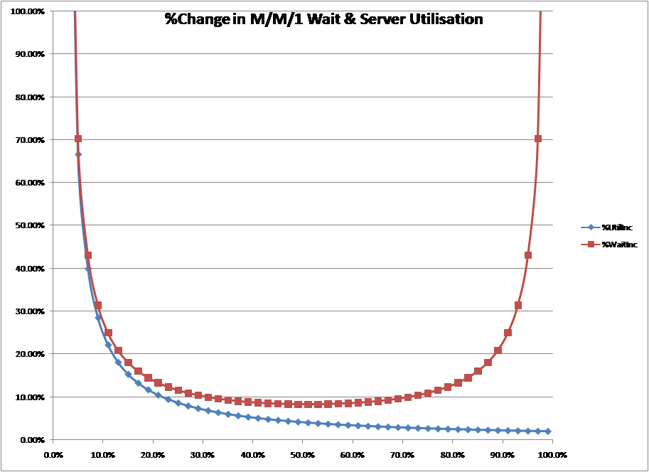
Definition 4: It’s the point where the queuing curve goes up as quickly as it goes across
I seem to recall this from some time ago and may have used it myself in the past. As normally stated, the definition is a little vague as to whether it refers to response time or wait time, or whether it refers to absolute change or percentage change. However, the absolute option can be quickly dismissed because utilisation goes from 0 to 1 while response time or wait time goes from 0 or 1 to ∞.
This leaves the definition which says it’s the point, in % terms, where the response time curve or wait time curve goes up as quickly as it goes across. The charts below plot the percentage change in response time or wait time and the percentage change in utilisation.
In the case of the response time curve, the point at where it goes up as quickly as it goes across (where the lines cross) is about 50%. In the case of the wait time curve the two never really cross, except at 0%.
 |
 |
There is a further variation of this definition in the 1999 paper by Cary V Millsap [Reference 9] which states that it is “the point where the vertical momentum of the line begins to equal the horizontal momentum of the line“. However, what is meant by momentum is not clearly defined.
The paper later goes onto say that “Figure…shows that even for an M/M/1 curve there is a point near 70% utilisation at which the curve begins to go ‘up’ faster than it goes ‘out’“, which is the discussion above.
Finally, in a footnote, the author suggests the point can be found by differentiating the response time or wait time curve with respect to utilisation and solving for a value equal to one. Presumably, the technique aimed to calculate the utilisation where the line went up as quickly as it goes across. But this is wrong, something that Millsap alludes to in his later book. [Reference 8]
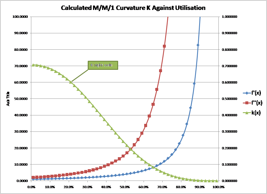
Definition 5: It’s the greatest curvature on the curve
Thanks to Adrian Johnson of Hyperformix, I found that curvature can be mathematically defined as defined as:
K = f”(x) / (1 + f'(x)^2)^3/2
And the greatest curvature happens when K equates to 1. As you can see, this involves the first and second differential of the response time curve. In the case of the M/M/1 response time curve:
F(x) = 1 / (1-util)
F'(X) = 1/ (1 – util)2
F”(X) = 2/ (1 – util)3
The differentials of the wait time curve are similar.
Using these formulae to calculate curvature over a range of utilisations gives the chart below which plots F'(X), F”(X) and K for different values of the response time curve between 0% and 100% (note: the values of K are plotted against the right hand scale). As you can see, k is highest and therefore curvature greatest at 0% utilisation.
|
|
 |
|
Definition 6: It’s the point on the curve where it breaks away from the straight line
One source stated, “For utilization levels of up to 70 percent, queue length follows an approximately linear relationship to utilization. Above 70 percent, queue length starts to grow asymptotically, tending to infinity as utilization approaches 100 percent”
In this definition, there is no clear explanation of how you calculate the break-away from the straight line, so I have taken the definition to mean how well a straight line can be fitted to the curve.
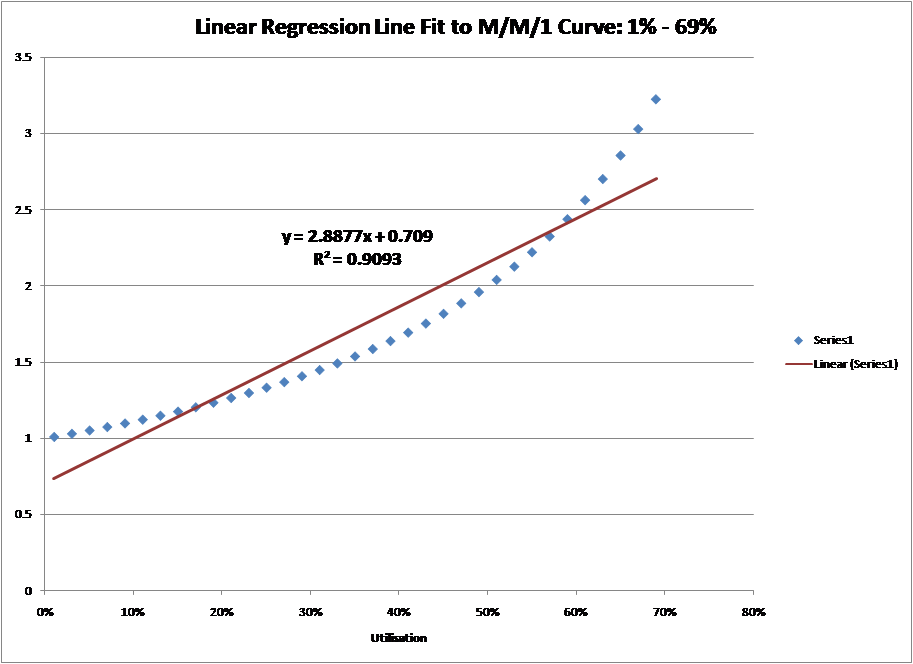
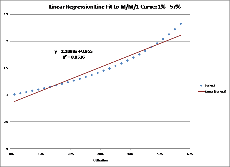
This explanation is one of my favourites as it highlights the fact that, up to a point, a straight line can be fitted to the M/M/1 curve with reasonable accuracy. If you enumerate the M/M/1 response time curve at 2% intervals and then put a linear regression line through it between 1% and 69%, you get an R-squared (think of it as a goodness of fit) of about 0.9. As 1.0 is a perfect fit, this is a pretty good. Beyond the 69% utilisation level the fit worsens.
Unfortunately, nobody says that 0.9 is the deciding value between a good line fit and a bad line fit. If you set the fit to a higher standard, say 0.95, then the line can only be fitted between 1% and 57%. Thus, until we agree on the level of accuracy for the straight line fit, this explanation doesn’t help.
 |
 |
Definition 7: It’s defined by operational analysis
Operational analysis is a reformulation of the accepted queue theory formulae in a more practical format [Reference 1]. One of the operational analysis formulae defines:
Response time [R] = Number of users [N] / Throughput [X] – Think Time [Z].
Using this formula, together with the demand time for the bottlenecked device allows the following two graphs to be derived (Note: in this case server time = 2 seconds giving a throughput [X] = ½ with think time [Z] = 10 seconds. The exact response, the dotted line, has been added manually, in line with Jain, Reference 1)
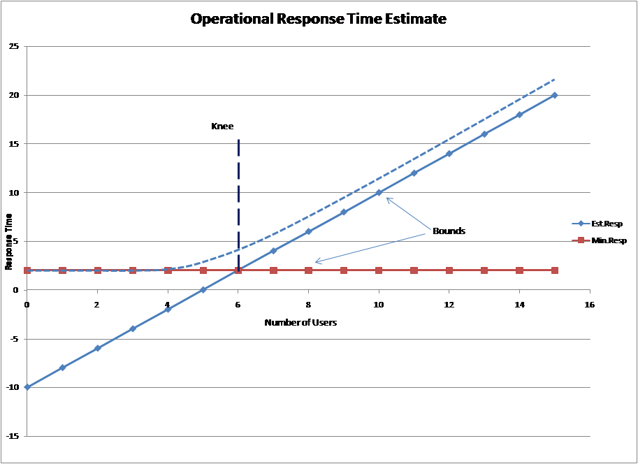 |
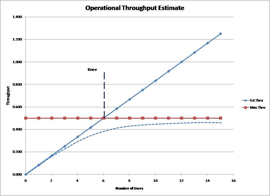 |
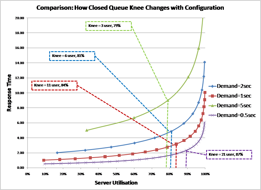
But look closely at the two graphs and you will see that in this definition the horizontal axis is the number of users, not utilisation. This is because the definition is based upon a “closed queue system” not the M/M/1 “open queue system” we have been discussing up to now. In a closed queue system, load is added by increasing the number of users in the system and it has a completely different response curve to an open system. Converting the graphs above into one based upon utilisation using a mean value analysis (MVA) algorithm and comparing against the M/M/1 curve gives the following chart.
|
|
 |
|
One may think that this chart provides the solution, albeit indirectly. By establishing the knee from the top graphs and then converting to utilisation as shown above, you get the knee in utilisation terms. This was tested by the enumeration of several different scenarios.
The position of the knee, in terms of the number of users, as defined by operational analysis, is always at the point given by the formula:
Number of Users [N] = (Think Time [Z] + Service Time [T]) / Service Time [T]
Note: this is the point at which the server would be 100% utilised if there were no contention for the server. Then using the MVA algorithm with service demand times of 0.5/ 1 / 2 and 5 seconds and a fixed think time of 10 seconds, system response times and server utilisations were calculated. The chart below summarises the results
|
|
 |
|
As can be seen from the chart, the knee is not fixed in utilisation terms; it shifts to the right as the number of users in the system increases.
Therefore, while this definition may well define a “knee” in circumstances where the number of users is changing the definition cannot give us the traditional “knee in the curve” because it does not address the traditional queuing curve. Also, in terms of utilisation, this definition provides a knee that varies, thus, it cannot be used as a utilisation threshold to manage a system.
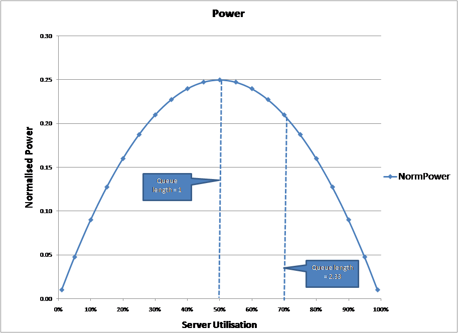
Definition 8: It’s derived from the power law
In response to my UKCMG challenge that I mentioned earlier, Paolo Cremonesi (Neptuny) supplied me with a definition based upon the power law. In this definition:
Power [P] = Throughput [X] / Response Time [R]
Substituting from the operational analysis equations:
Throughput [X] = Utilisation [U] / Service Demand [D]
Response Time [R] = Service Demand [D] / (1 – Utilisation [U])
Power [P] = U * (1 – U) / D2
Then for a fixed service demand, the power curve against utilisation is:
|
|
 |
|
An interesting idea, but as can be seen from the graph, using this definition the knee in the curve is around 50%, not the traditional 70%
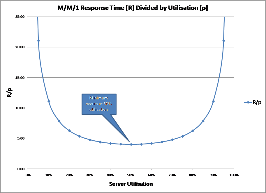
Definition 9: It’s the utilisation where response / utilisation is minimised
In their book on Oracle Performance Cary Millsap & Jeff Holt say the knee in the curve “occurs at the utilisation value P* at which the ratio R/p achieves its minimum value“. In this notation:
R = Response Time
P = Utilisation
Enumerating the response time curve and calculating the response time formula gives the curve below:
|
|
 |
|
This is a very familiar curve. If you substitute the M/M/1 response time formula into the R/p formula and replace “p” with “U”, the notation we have been using for utilisation you get:
R/p = Service Time / U * (1 – U)
This is, in effect, the inverse of the power formula in definition 8. Unfortunately, like that definition, it does not give the traditional 70% figure.
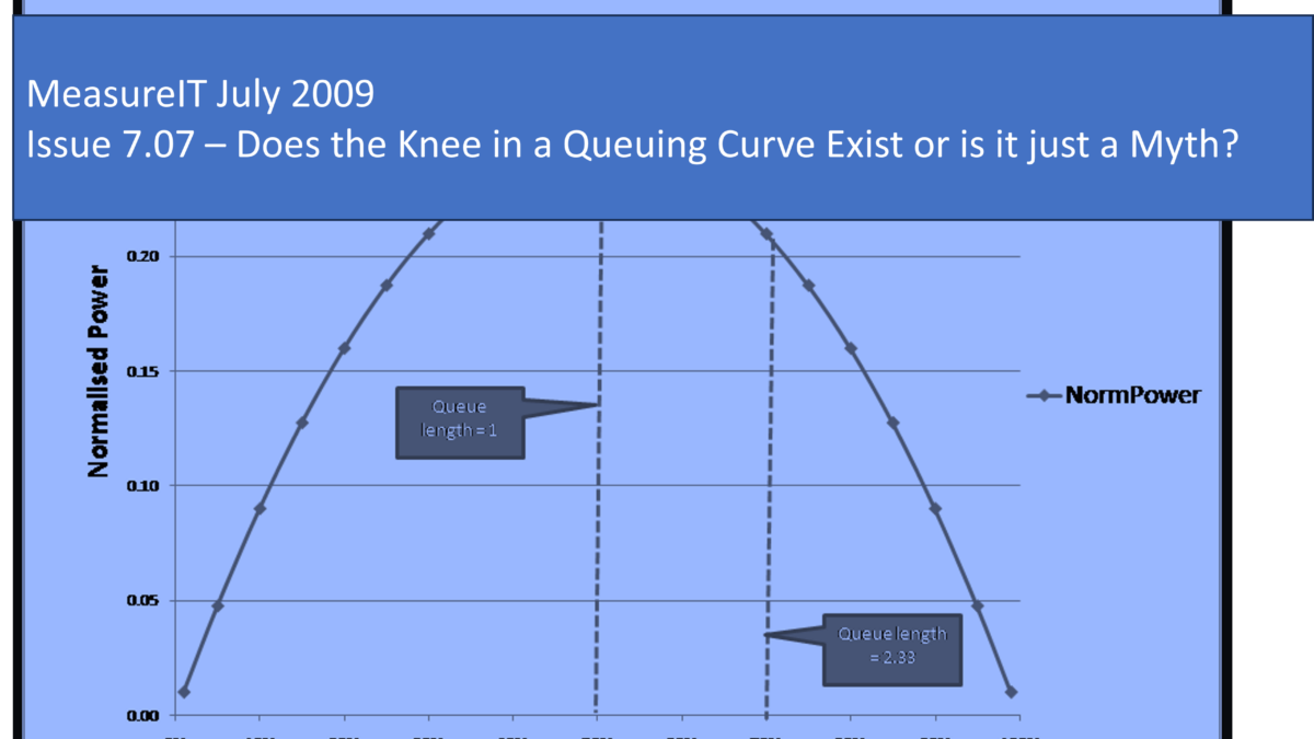
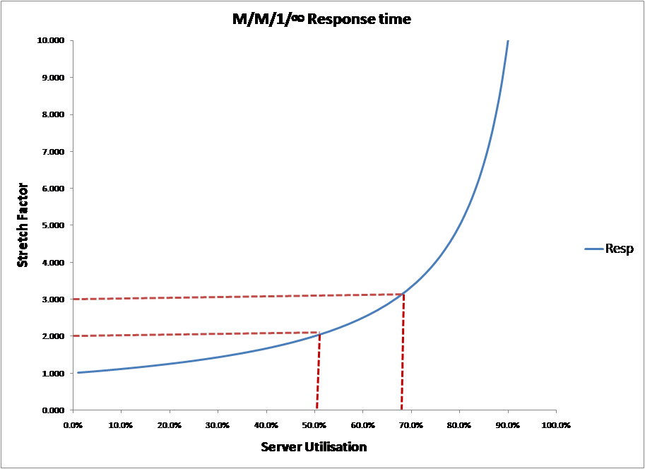
Definition 10: It’s the point on the queuing curve where you wait twice the service time
This is my old professor’s definition and it certainly works. A simple enumeration of the M/M/1 response curve shows that this point (stretch value = 3, service time + 2 * wait time) occurs at about 67%, which would give you a knee around the traditional value of 70% that you would expect.
|
|
 |
|
However, the value appears to be arbitrary. He could have easily have said the point was “where you wait as long to be served as you take to be served“, in which case the knee in the M/M/1 curve would have been at 50% utilisation.
So having reviewed 10 different definitions what do I conclude?
Some definitions are obviously wrong. Those that define it in terms of “greatest gradient“, “greatest change in gradient” or “greatest curvature” only yield results at the extreme of the curve.
Several definitions yield answers around 50%, not the traditional answer of 70%. Those include “where the curve goes up as quickly as it goes across, in % terms“, “the power law” or “where response / utilisation is minimised“.
Operational analysis may define a knee, but not in utilisation terms. Translating the definition to server utilisation shows that this knee is not a fixed value.
Two definitions do provide the traditional answer. Both “the breakaway from the linear line” and the “wait time is twice the service time” can give the traditional answer of around 70%, but only by applying totally arbitrary measures of quality.
Therefore, in summary:
-
- I can find no clear definition of what constitutes the knee in the curve.
-
- All the definitions collected that provide creditable answers at first glance do not agree with the traditional 70% utilisation level or they make use of arbitrary quality levels.
As a result, I suspect that the “knee in the curve” is a fable and there is no “magic level” beyond which response times decay badly.
All of which is a bit worrying, especially for those sites that routinely upgrade when a utilisation threshold is reached. Such an approach to capacity management may now be suspect, as any threshold level set should be regarded as arbitrary.
This should also worry some distinguished capacity-performance experts.
Of course I could be wrong and there is another definition out there which resolves my worries. If so, please send me your ideas to the following email address: Michael.Ley[at]ukcmg.org.uk
However, until that time I must conclude that the “knee in the curve” is a myth and one which, as the Mythbusters say, “is busted“.
References:
- The Art of Computer Systems Performance Analysis, Raj Jain, Chapter 13
- Oracle Database 10g Linux Administration, Chapter 4 – Sizing Oracle 10g on Linux Systems
- Microsoft SQL server 2000 Performance Tuning Technical Reference, Chapter 8 – Modelling for Sizing and Capacity Planning
- Performance Assurance for IT Systems by Brian King, Chapter 5 – Hardware Sizing: The Crystal Ball Gazing Act
- The Essentials of Computer Organization and Architecture by Linda Null and Julia Lobur, Chapter 10 – Performance Measurement and Analysis
- Paolo Cremonesi, private communication
- Operating .NET Framework-Based Applications: On Microsoft Windows 2000 Server with .NET Framework 1.0, Chapter 13 – Sizing and Capacity Planning for .NET-Based Applications
- Optimising Oracle Performance by Cary V Millsap & Jeff Holt
- Performance Management: Myths & Facts, Cary V Millsap, Oracle Corporation, 1999
- Dr Dave Ellman, Leeds University, queue theory course


